


Colour Inspiration: five Colour Proposals to Coordinate the 2026 Collection
Finding fabrics that work well together is essential for creating a cohesive interior. The colour ranges of Les Créations de la Maison are designed to make this process easier: their colours, textures and designs make it possible to combine pieces from different collections while always maintaining the same visual harmony.
To showcase all these possibilities, we have created five moodboards in which the new 2026 arrivals come together with some of our best sellers, ranging from cooler blue and grey tones to terracottas, greens, mustards and natural shades.

Colours Designed to Work Together
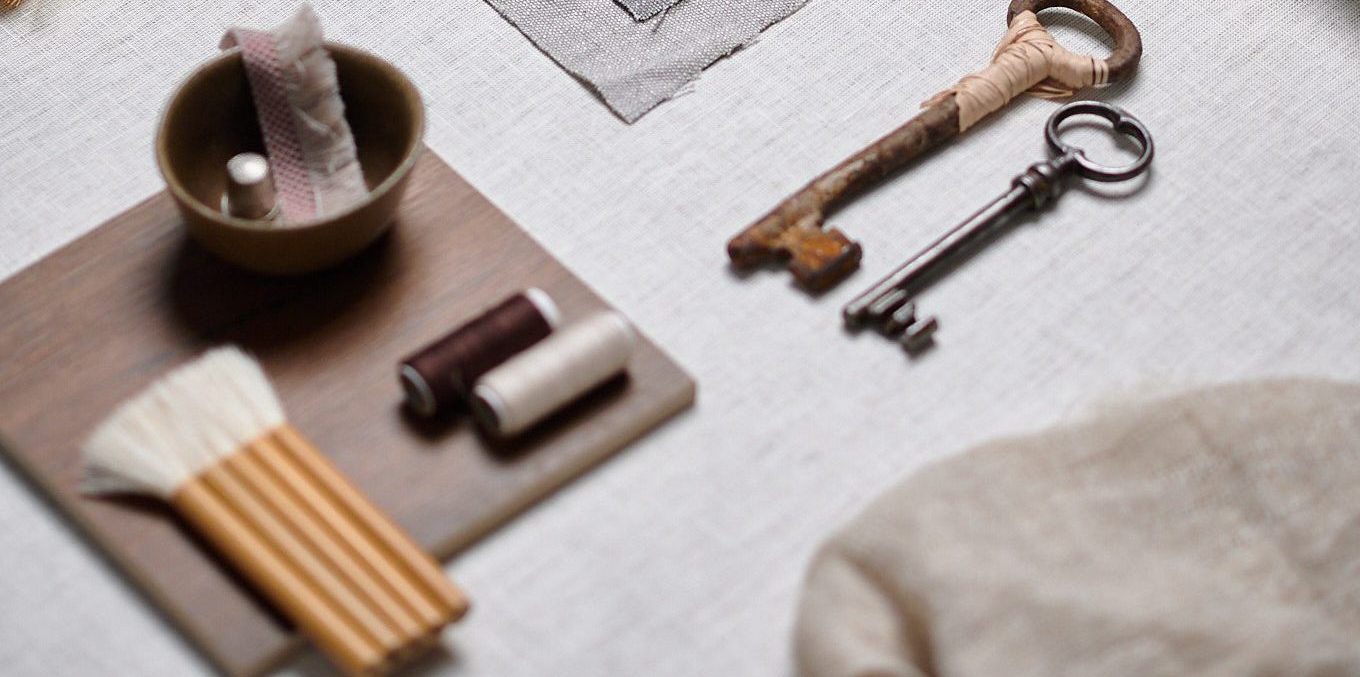
Each moodboard is built as a small scene. Fabric samples, cushions and swatches are presented alongside flowers, ceramic pieces, desk accessories and other elements selected according to the character of each palette. These elements complete the colour universe, highlight specific textures and help to imagine the fabrics beyond the sample book. The result is a more visual and evocative interpretation of the collection, designed to discover new nuances and possibilities.
01. Cool Tones, Blues and Greys
The first moodboard moves between smoky blue, pearl grey, anthracite and small accents of ink blue. The Bloom cushion sets the tone for the composition, accompanied by the colour gradations of Canyon, Norton, Gothenburg and Country. Paisley introduces a classically inspired pattern, while Minos and Teseo provide a geometric counterpoint. The stripes of Murray and Shizen, the lightness of Shale and the nuances of Icaro and Pause expand the interplay of textures.

Bloom 04 | 2. Canyon 1 – 16 – 501 – 517 | 3. Paisley 35- 46 | 4. Murray 52 | 5. Shizen 19 | 6. Norton 18 – 19 – 20 | 7. Icaro 5 | 8. Minos 71 | 9. Teseo 2 | 10. Gothenburg 3958 – 4022 – 6182 | Shale 03 | 12. Pause 18 | 13. Country 35 | 14. Country 46
02: Warm Tones: Terracottas and Browns
Terracottas, tile reds, dusty pinks and browns create a warm palette that maintains a light, airy feel. The stripes of Murray, Gea, Imlil and Etna structure the composition with different rhythms and scales. Siracusa and Palermo concentrate the most intense tones, balanced by the neutrals of Country, Drapey and Toubkal. Wood, brass and small vintage-inspired objects, such as a key, a pipe and a colour book, extend the colour palette.

Murray 50 | 2. Siracusa 22 – 23 | 3. Gea 05 | 4. Palermo 60 – 72 | 5. Country 8 – 60 | 6. Imlil13 | 7.Etna 05 | 8. Drapey 13 | 9. Toubkal 13 l 10. Drapey 11
03. Greens and Mustard
This proposal explores a wide range of greens, from sage and eucalyptus tones to deeper olive, with mustard as an accent. The textures of Gravel and the geometric motifs of Frame are combined with the checks and stripes of Dunbridge, Dunning and Errol. Shizen, Country and Gothenburg complete a combination in which small-scale designs, textured surfaces and smoother fabrics come together.

Gravel 01 | 2. Frame 03 | 3. Dunbridge 387 | 4. Dunning 387 | 5. Gravel 03 | 6. Minos 76 | 7.Shizen 304 | 8.Frame 01 | 9. Errol 387 | 10. Country 26 | 11. Gothenburg 4005- 6177 – 6173
04. Off-Whites and Beiges
Off-whites, sand and beige tones form the brightest palette in the series. Genk, Gauzy, Arden and Sylvain combine different densities and finishes within a very restrained colour range. Fringe adds volume, Gothenburg introduces a soft stripe and Shale brings transparency and lightness. The interest lies in the tactile contrasts: irregular surfaces, open weaves, substantial fibres and fabrics that filter the light.

1. Genk 21 – 23 – 24 | 2.Gauzy 1 | 3. Arden 4 | 4. Sylavin 1 – 4 | 5. Fringe 1 | 6. Gothenburg 21 – 23 | 7. Shale 8 | 8. Arden 2
05. Linen and Natural Tones
The final moodboard is centred around the look of linen and a palette of stone, oatmeal, taupe and dark brown. Mixt, Canyon, Pause and Bloom offer different textures and patterns, while Fantasy and Sylvain introduce lighter details. Frame, Gravel, Core, Norton and Parma complete the palette with subtle geometric patterns, stripes and natural-looking textures.
The result captures the purpose of Colour Inspiration: to facilitate cohesive combinations and discover new relationships between the fabrics in the collection.
Mixt 1 | 2. Canyon 2 – 13 – 521 | 3. Pause 14 | 4. Bloom 2 | 5. Fantsay 1 | 6. Sylvain 3 | 7. Frame 5 | 8. Gravel 4 | 9. Core 6 | 10. Norton 5 | 11. Parma 2
A Colour Guide for Interior Design Projects
These five colour palettes are intended as a starting point for interior design and decoration projects. From them, it is possible to carry the same colour harmony through to curtains, upholstery, cushions and other textile elements, adapting the selection to the character of each space. Colour Inspiration reflects the key idea behind the 2026 Les Créations de la Maison collection: a versatile and cohesive range of fabrics that offers multiple possibilities within the same aesthetic language.

Discover the collection on our website


